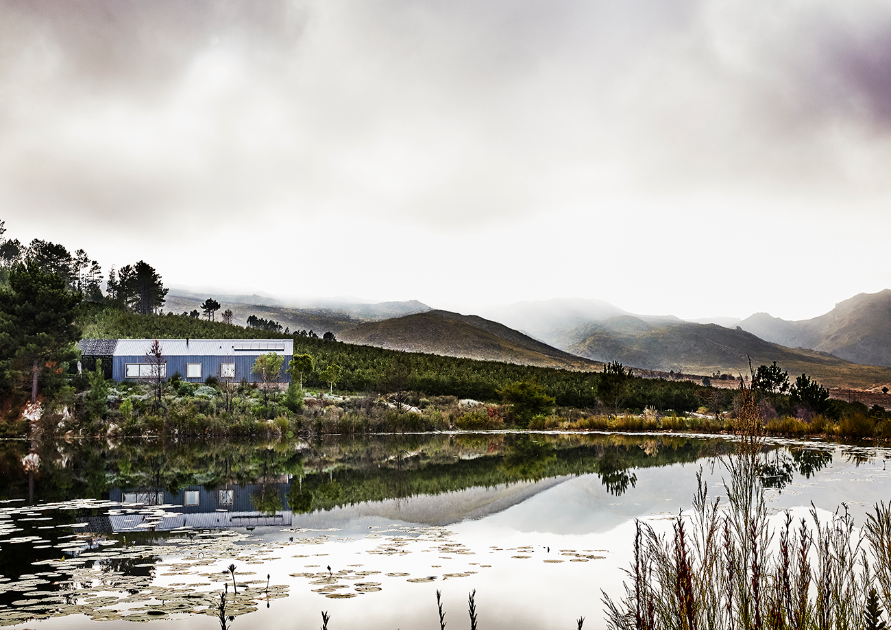
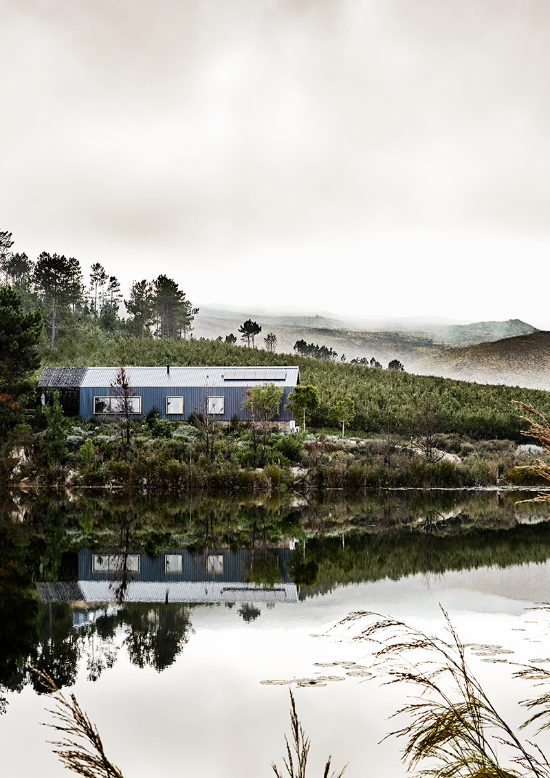
This contemporary take on a traditional barn structure among the apple orchards of the Elgin Valley makes for a simple, inspiring weekend getaway for a Cape Town family.
The Elgin Valley is the apple-growing capital of South Africa. The valley is filled with orchards as well as cool-climate vineyards, and is surrounded by mountains and nature reserves, including the protected Kogelberg Biosphere. It’s also less than an hour’s drive from Cape Town, which makes it the perfect weekend escape from the city. That’s why hotelier and entrepreneur Jody Aufrichtig chose it for his delightfully eccentric lodge, the Old MacDaddy, where the rooms are luxuriously and creatively converted vintage Airstream trailers.
In fact, it seemed so perfect that there came a point at which Jody and his family – his wife Deirdre and their four children, Mina Mai, Jai, Sophie and Luca – thought they should have a holiday home of their own there: a private spot where they could leave their clothes.
Architect Greg Scott and his team had worked with Jody on various projects over the years (Greg had designed the main barn-like venue at the Old MacDaddy, where there’s a restaurant and a swimming pool and space for weddings and events and so on), so the Aufrichtigs began discussing their idea for a weekend bolthole with him.
They’d earmarked a beautiful spot near the farm dam, backing onto an orchard, with views over the water and the valley beyond. “I wanted to be near water, because the birdlife is incredible,” says Jody. “Early in the morning, I watch the ducks landing on the dam. It’s just lovely.” He and the kids love swimming and canoeing across the dam too, so the idea of having a house “right on top of the water” appealed enormously to the family. The site they chose faces west, so in the evenings there are beautiful sunsets over the water as the sun dips behind the distant mountains.
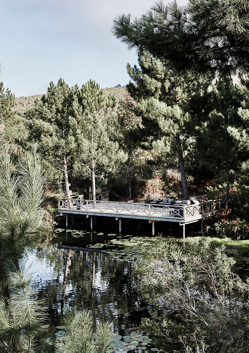
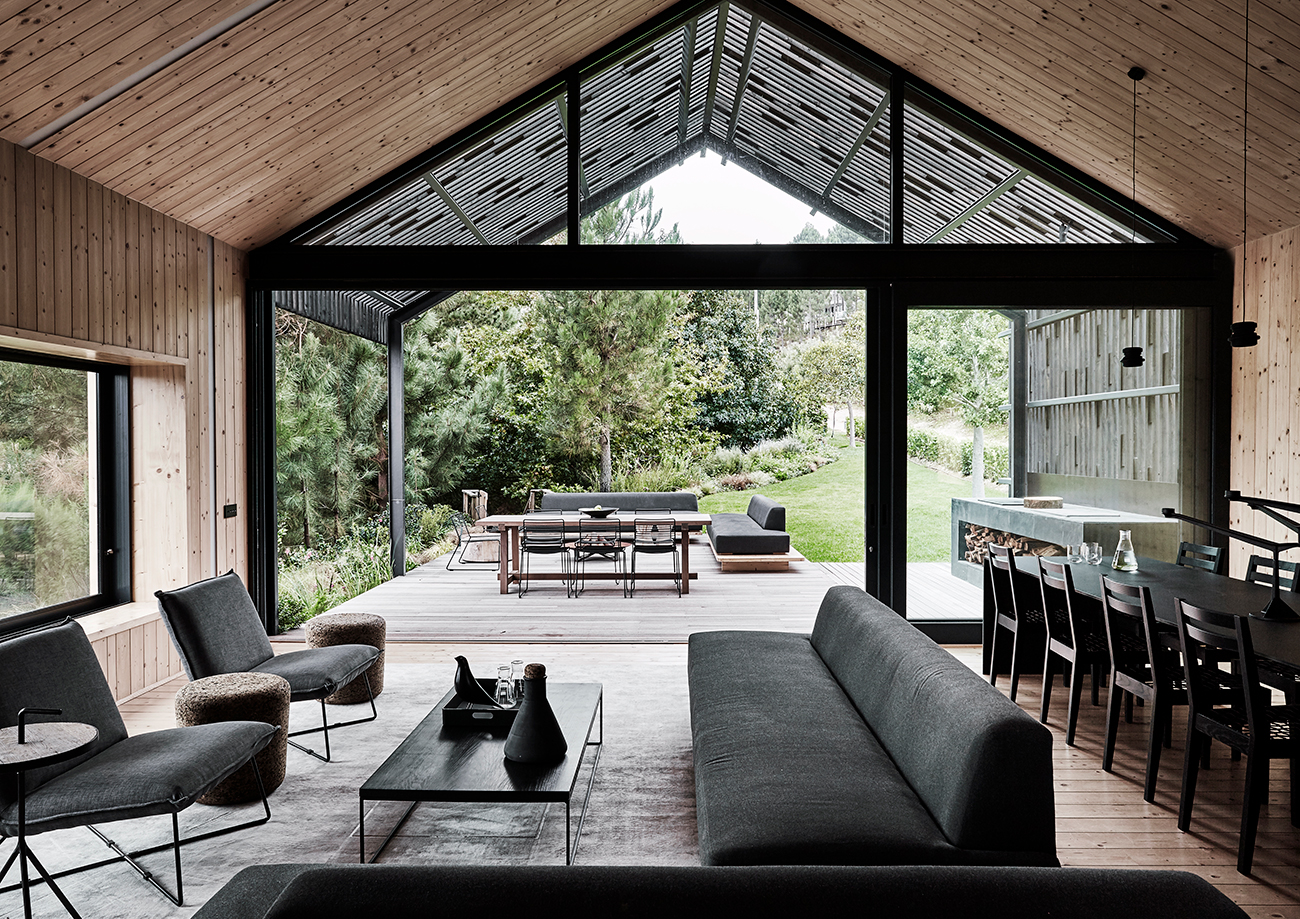
Greg had already begun exploring a contemporary barn aesthetic at the main lodge building, and was keen to reinterpret and extend the idea for a holiday house. “It’s a very pure architectural form, and if you can stay true to it, and put some beautiful punctures and apertures in it, and open up the ends, it’s an amazing way of building,” says Greg, adding, “and obviously relates very well to its context.” A barn shape, inevitably, looks right at home in an orchard.
Barns also make for simple, practical construction – especially in remote areas such as Elgin, where you’d want to disturb the landscape as little as possible. “The steel portal frame is made off-site and can be erected quickly,” says Greg. So essentially, that’s what his team did – popped up a steel frame, enclosed it, and clad it in corrugated roof sheeting, cleverly layering in modern systems such as solar power to keep its creature comforts sustainable and its ecological footprint small.
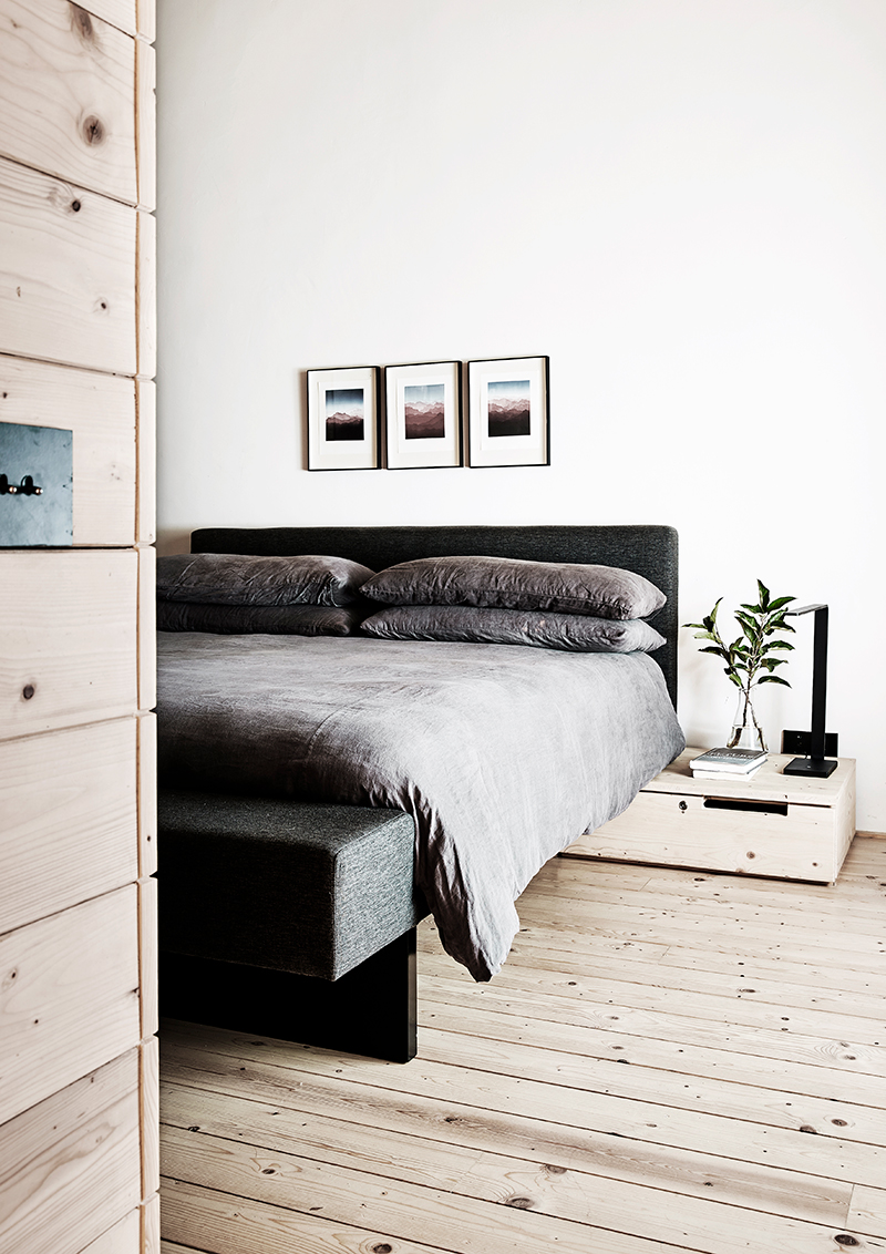
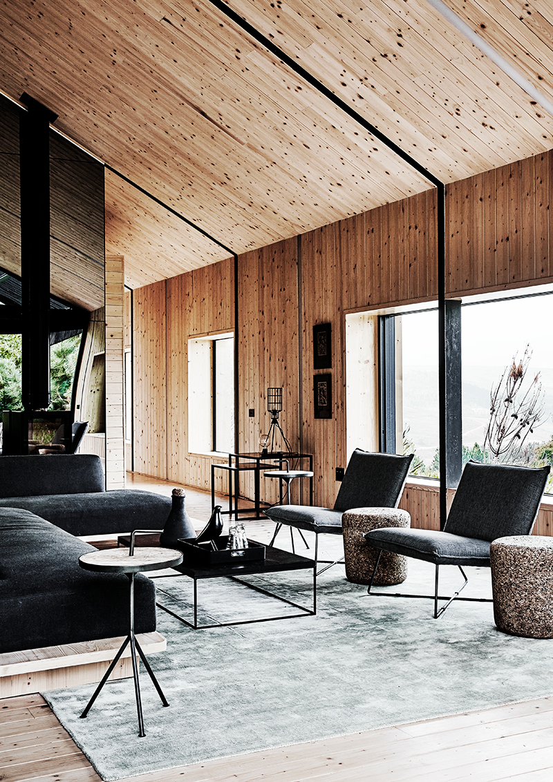
The interior is almost entirely “skinned”, as Greg puts it, in spruce. The pale timber walls and pitched ceilings follow the building’s exterior silhouette with simplified, clean lines so you can “read” the barn shape from inside, too. The furnishings, lights and even the pots and pans, were to be black. “We thought we’d have some fun when you step into the bathrooms and they were predominantly stone and a series of white finishes,” says Greg. The stone was harvested from the site, and the rough, raw textured finish stands in contrast to the refinement of the living and bedroom areas.
Greg has been very restrained in the way that he has positioned the windows. “We did very few openings on the sides, but they were very considered and composed,” says Greg. They’ve been positioned to frame views and create “a slightly irregular spread of light” throughout the interiors. They are set in deep wooden recesses so that a person can fit right inside them, like a window seat or a little pod off the living area where it feels as if you’re “inside and outside at the same time”. “You can imagine sitting there and having a little siesta or reading a book while the kids build puzzles or play with Lego,” says Greg.
While the views might be carefully edited along the length of the house, they’re “sucked in” as Greg puts and “bounced around” the living room by a huge mirrored wall. “It makes the house feel a lot bigger than it is,” says Greg. He points out that it makes it possible, inside, to sit with your back to the garden, and yet see what’s behind you. “It really is an interesting game that you get to play with space.”
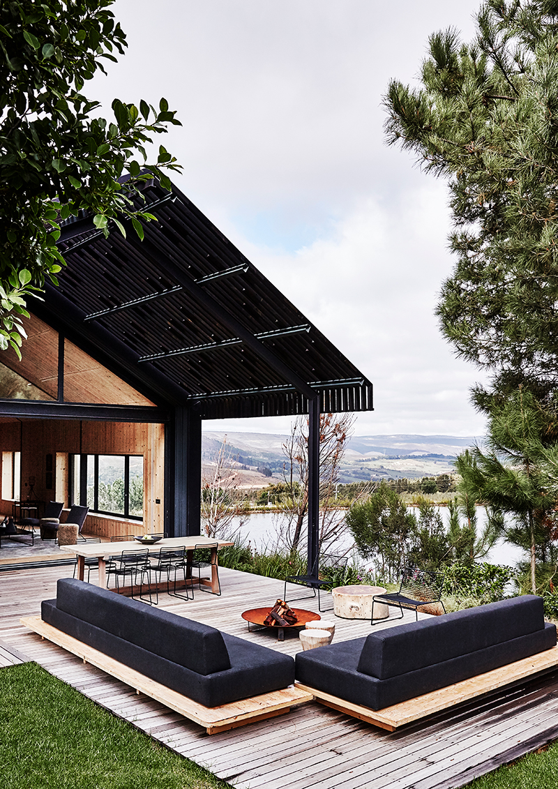
While the mirror playfully blurs the distinction between inside and out, it also underlines the point that the house is ultimately outward-looking. In fact, as Jody says, it’s deliberately small not just to simplify and declutter, but also because the family’s weekend and holiday breaks in Elgin are about being outdoors. Jody’s favourite spot is the outside entertainment area. “I spend most of my time there,” he says. “We’ve got a gas braai and a wood braai. I braai every night, I think. It’s actually not about the food for me, it’s about standing around the fire.”
Greg points out that, as the transitional zone between indoors and outdoors, the outdoor entertainment area called for a creative response that would allow the functional, engineered language of the barn-shape “to blend and knit and mesh” with its setting. His response was a blackened timber pergola structure that extended the lines of the building, not only break up its mass visually, but also acting as a screen against the sun and wind. Inspiration came when they realised that to prevent the long runs of timber from warping and twisting, they’d have to pack the gaps with stabilising wooden blocks. “Instead of having the all in the same place, we randomly scattered them,” Greg explains. “The idea is to create filtered, mottled light, so that it feels like you’re under a canopy of trees.” At the same time, it is “where the strong industrial engineered architectural forms dissolve and disaggregate into something that’s a little bit more organic and natural.”
Greg and his team were largely responsible for the interior design of the home, too. They designed a number of the furnishings and finishings and had them custom made, including the steel-fronted kitchen and the wooden couches and bed units, and the free-standing bathroom units and mirrors. But they also helped source furniture to complement the timber-skinned envelope with a “fairly slick minimal stripped-down” palette “balancing timber and black and dark finishes”.
The custom-made furnishings were all manufactured by the contractor who did the spruce interiors, so there is “coherence and consistency”. “It’s a pet hate for me when you’ve got timber that doesn’t match,” says Greg.
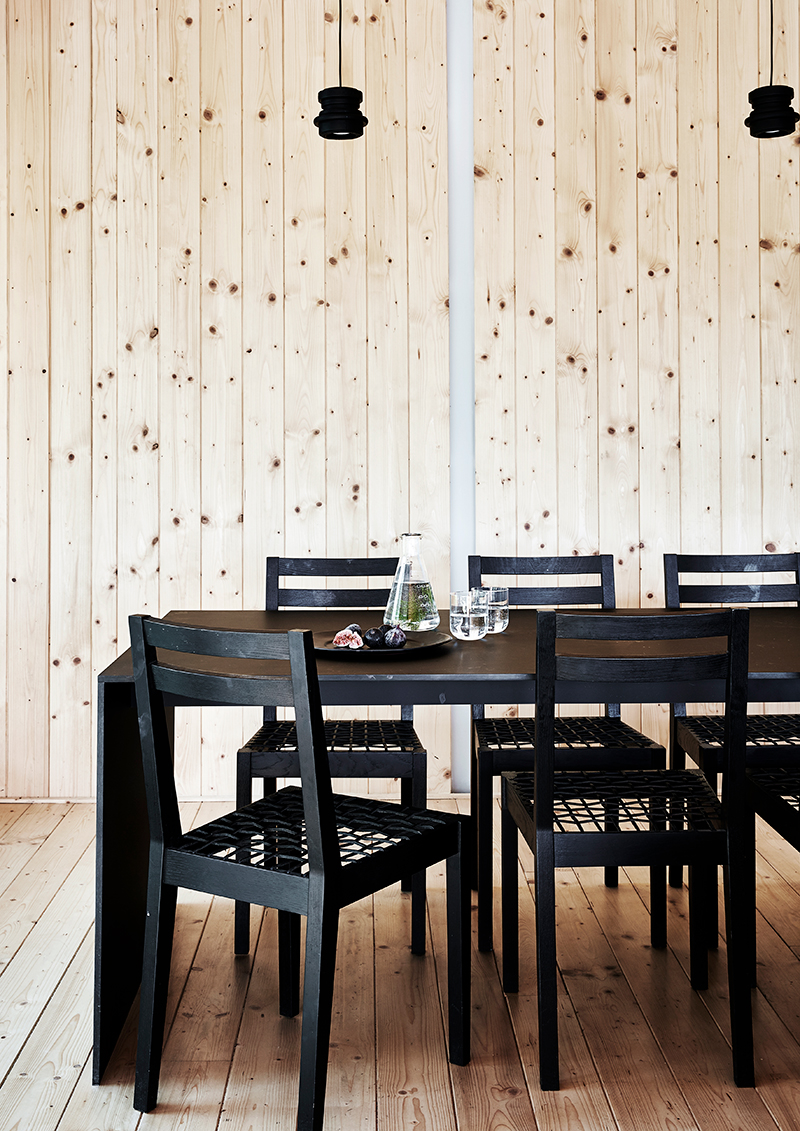
Likewise, the black furnishings bring coherence and continuity to the rooms. “I think black offers massive opportunities from a design point of view,” he says. “It’s a wonderful way to sew spaces and objects and elements together.” He likes the way black gives each piece of furniture an identity without being “busy”, which is an asset in a small space.
But that’s not to say the black is dull or uniform. In fact, Greg’s found some poetic ways to humanise the somewhat industrial materials. The kitchen counter, for example, is a specially blackened brass, treated with heat to darken its surface. “It weathers and oxidises over time, so it develops a patina, almost as a character with story of its own,” he says, “but underpins that industrial aesthetic that we were working with.” He compares its charm to that a shipwreck. “They might be hard, engineered steel machines, there’s a softening and almost an impermanence in something that changes like that and weathers.”
While the palette might be carefully controlled, there is an energy and dynamism introduced by the asymmetrical arrangement of the interior furnishings. “I abhor symmetry,” says Greg, “so you’ll see nothing is in the middle of anything, nothing is mirrored, nothing is repeated.” At the same time, the predominantly strong, angular, masculine forms are offset with the occasional circular element, such as a table. “It really tempers the space,” says Greg.
This kind of simplicity suits Jody perfectly, who vehemently believes that part of the clarity and sense of peace, perspective and creative freedom that his visits to Elgin offer him has to do with the eschewal of clutter. “I don’t want things,” he says. “I don’t have technology around the place. It’ simple, there’s no clutter and actually, I’m much happier. People seem to walk into the place and smile, for some reason, and that’s the foundation for me.”
Text Graham Wood | Styling Sven Alberding/ Bureaux | Photographs Greg Cox/ Bureaux


