Box™ Design Lead Tim Hogarth discusses his favourite Auckland building: Tim has an eye for finely-designed buildings that knit together our urban landscape (actually some might call that an obsession).
 When he’s not working as a design lead at Box, he’s researching, drawing and building miniature models of the world’s most fantabulous skyscrapers – see our story here. Closer to home, he is captured by the elegance and bravery of the design of the Auckland Art Gallery Extension.
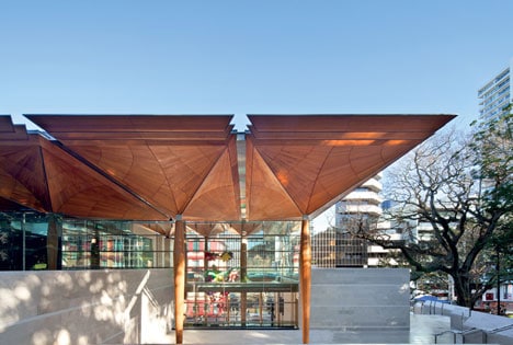
Toi o Tāmaki Auckland Art Gallery in Kitchener Street first caught his attention when he was walking to the bus stop from university. “At night, the new entrance looked like a lantern in the dark,” says Tim.
Designed by FJMT in partnership with Auckland-based Archimedia, the contemporary extension links to the existing French Renaissance part of the gallery built in 1887. There is no subterfuge or attempt to disguise the juxtaposition – it clearly reads as a different era.

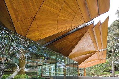
Tim calls the building “a work of art like the contents it holds” – and it’s easy to see why. Kauri clads the tall timber columns and the soaring canopy that covers the main atrium entrance. “It evokes a forest of trees and extends the gallery into its setting alongside Albert Park.” Against this, the heavy masonry-clad forms lend solidity to the design. But this street-side view that grabs the glory is not the only magical factor. “The older parts of the building have been restored and renovated, so there are many exciting architectural moments to discover,” says Tim, who wanders the halls not only looking at the artworks but how the colours and the architecture complement and enhance the multi-sensory experience.

Aucklanders have taken Toi o Tāmaki into their hearts and minds – but they’re not the only ones. The building earned the 2013 World Building of the Year at the prestigious World Architecture Festival. But how does its lofty magnificence affect the residential realm? By allowed New Zealanders to see and be inspired. “The Auckland Art Gallery extension is an example of a high architecture that is publicly accessible – there’s the opportunity to engage with and appreciate the spaces in person.”
Tim says that the ideas of transparency, lightness, weight, clear-massing and circulation seen here are all relevant to the work he does designing houses for Box™. “Our work aims to be easily understood, with resolved forms and refined floor plan arrangements,” he says. You may not have a manmade forest in your living room but thoughtful design is a way for fine art to be part of the everyday.


