The term ‘form follows function’ is used so frequently in architectural discourse that is has become as clichéd as ‘indoor/outdoor flow’. So what does it actually mean?
When architect Louis Sullivan (a pioneer of the American skyscraper) coined the phrase in 1896, he originally used the words “form ever follows function” and the simple premise was that a building’s physical attributes should reflect its purpose. Since then it’s a mantra that has lost its mojo – attributed to everything from stand mixers to mobile phones.
At Box™, we still think it’s a phrase that applies most aptly to architectural and spatial design and, while we embrace innovative technologies and materials, we also hold dear those traditional ideas that have proved over time to work – and work well.
Here’s a glimpse into how our designers interpret Sullivan’s idiom in the modern day.

Exterior
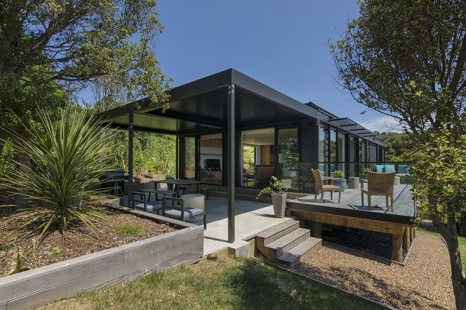
While there are certainly Box™ houses that feature the classic gable, more often than not, geometrically, they are box shaped – rectangular in form with a ‘flat’ roof. This is in keeping with our modernist roots but also serves a purpose. Often the horizontal plane of the roof can be extended out from the envelope of the building to create a covered outdoor area. Or, a ‘wedge’ can be cut into the design, again crafting an outdoor space but this time within the structural outline. Another advantage of the pavilion-style homes that have become our signature is that elements can be positioned on the section to create shelter. An L-shaped plan naturally forms a courtyard within its embrace; if sited correctly this is particularly useful to counter the prevailing south-westerly in Auckland. An H-shaped plan offers two courtyard opportunities for morning and evening alfresco living.

Interior
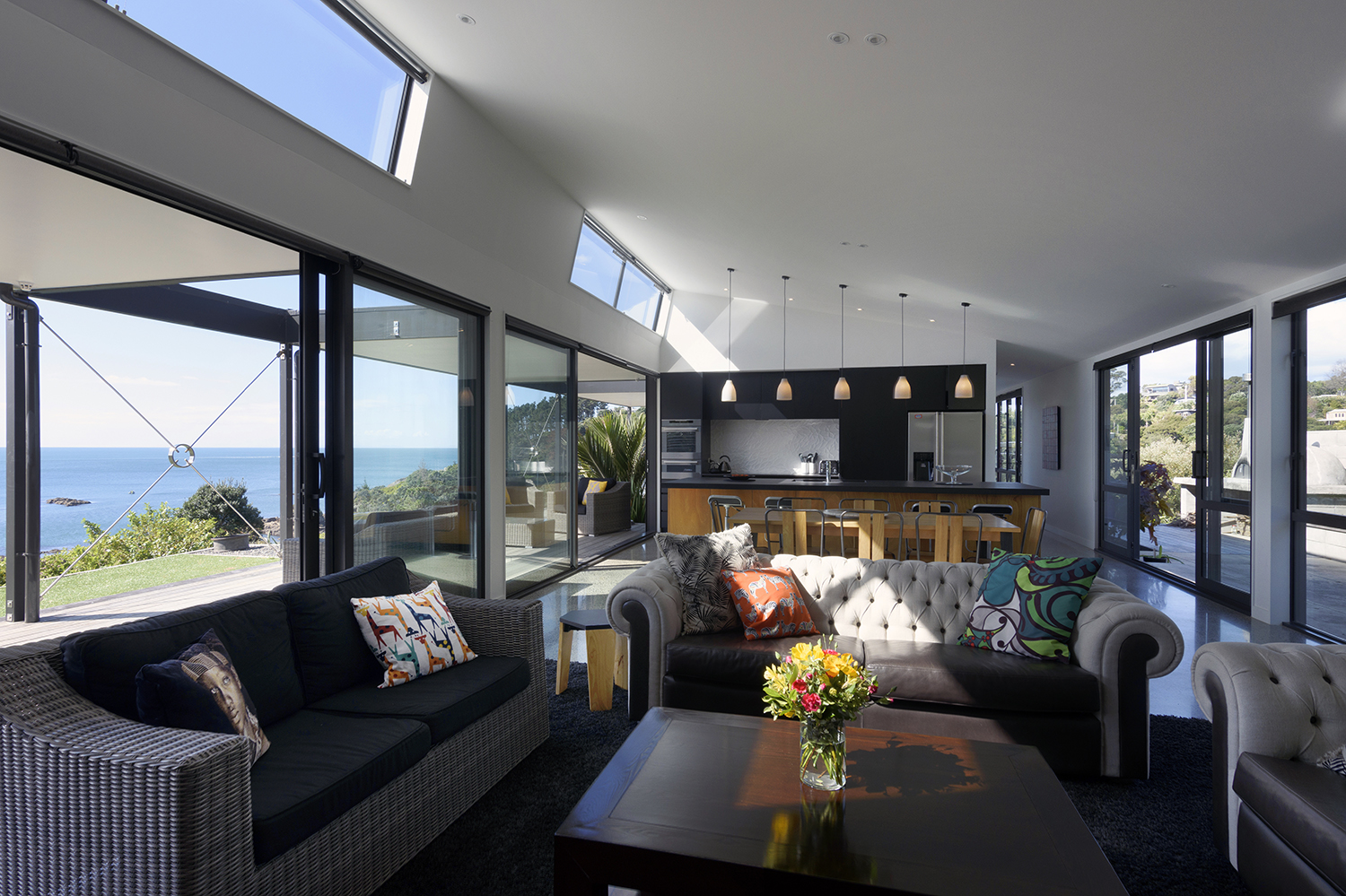
Open-plan is as old hat as sliced bread but still the best thing when it comes to spatial functionality. While it keys into a lifestyle we have all come to expect (from being able to keep an eye on young kids while you’re cooking a meal, to increasing the space for entertaining), there’s another good reason we favour this form – it wastes no space with unnecessary corridors. The trend to smaller homes and denser living makes this a practical, pragmatic choice. This and other efficient planning strategies that get more from less are the future for densifying our bigger cities.
Living rooms
Floor-to-ceiling glass which connects the inside to views and the immediate landscape offer another function – bringing in natural light and heat to make homes warmer in winter. This is a pretty obvious design move but we also use other strategies to keep living rooms working overtime to facilitate a family’s needs. Elements that act as dividers (such as staircase bannisters – usually slatted so they don’t block light) or bookshelves are built into the design from the outset. Then there are the opportunities to craft enhanced functionality with furniture such as bench seats in a window or featured in a nook in the mid-century diner-style that doubles as storage.


Kitchens & Bathrooms
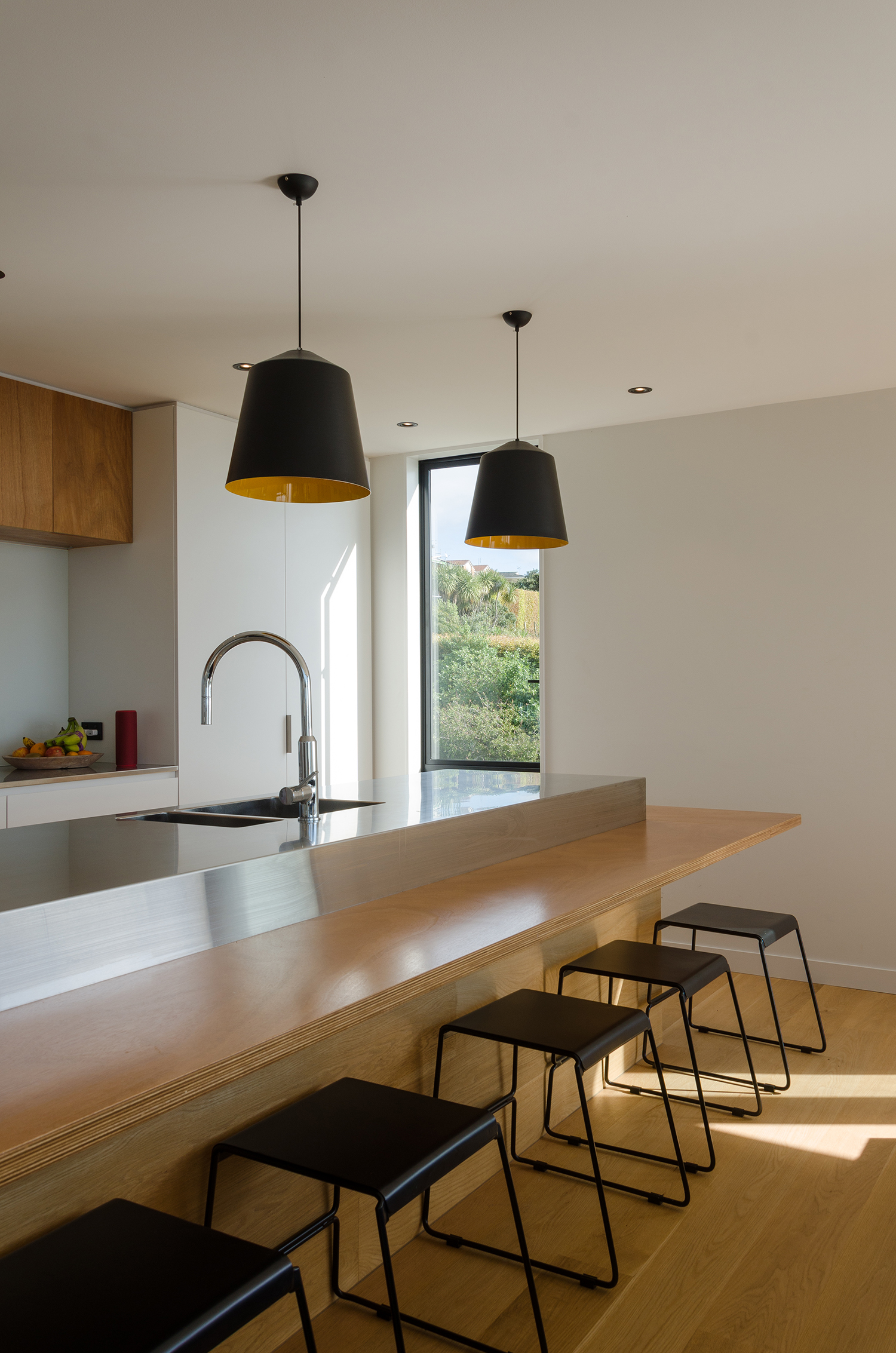
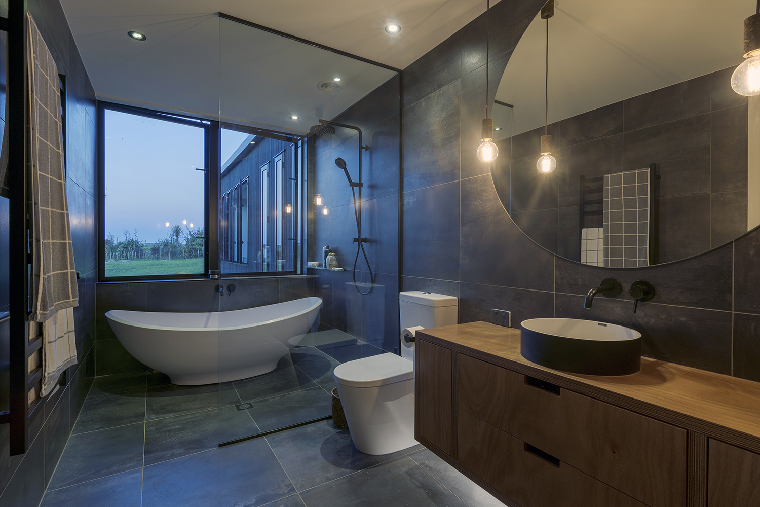
Kitchens and bathrooms are, by their very nature, utilitarian spaces that need to function more overtly than the other areas of the home. If they don’t, they’re an endless source of frustration for the occupants. It’s not surprising that a great deal of consideration therefore goes into a ‘form’ that will deliver the best results. At Box™, we design the kitchens and bathrooms as part of the overall package so it always has an authentic flavour that teams with the architectural spirit. Some pitfalls of thoughtless design include making an overhang on an island bench too shallow so that people cannot draw up the bar stool and sit comfortably; overhead cupboards that are too high for easy access (at Box™, we tend to stop the height of the cabinetry short of the ceiling so the kitchen appears like a piece of furniture in the space); designing a bathroom where the wet zone is too close to the dry zone, and not inserting enough task lighting or adding it as an afterthought. We also know that (and here’s another cliché), ‘God is in the details’ – a saying often attributed to architect Mies van der Rohe, although it is unlikely that it originated with him. Some of our detail is not decorative but functional – negative cut-out cabinet and drawer handles, for instance, which function well but don’t require the purchase of any additional hardware, open shelving precisely measured to accommodate items provided by the homeowners and bathroom units where the vanity top extends seamlessly across the back of the bath as a handy shelf.
When the same design language (and we mean in the literary sense) is repeated in articles ad nauseam, it is easy to become complacent and blasé about the real value to be found in sayings that have lasted generations. But, dig a little deeper, and you’ll discover that behind some of the best-known phrases lies a pathway that enables design to truly make a positive difference in everyday life.


